ShopDreamUp AI ArtDreamUp
Deviation Actions


Suggested Deviants


Suggested Collections


You Might Like…


Featured in Groups


Description
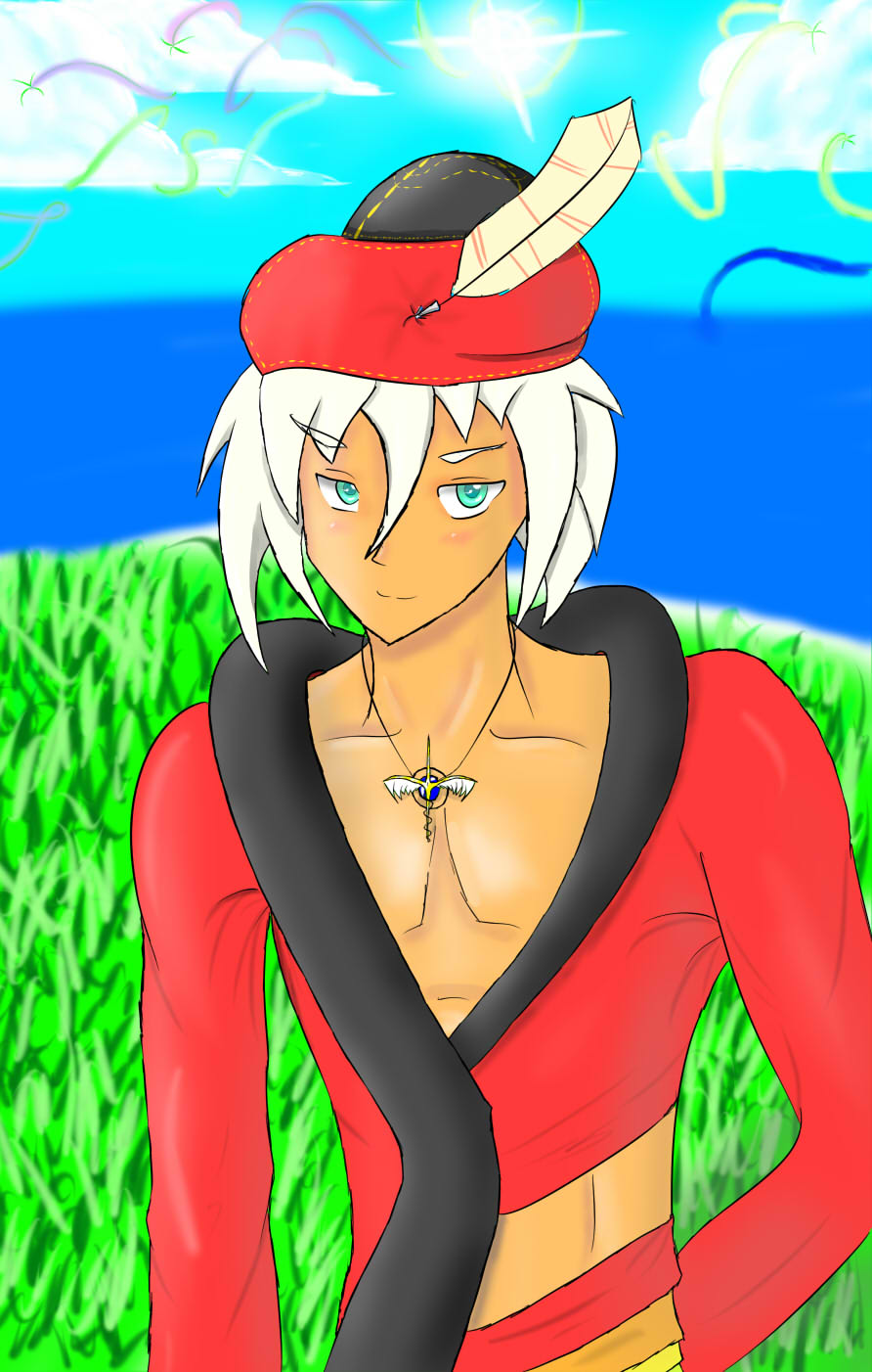
An art trade with a good friend of mine. 'Tis my speed-paint interpretation of a Summoner from her story's universe. It's really quite nifty - summoners summon creatures via a neural connection, and the story has lots of science and other stuff and also a political plot and god I need to go to bed. .____.
And also yes, I am aware the pose is weird and has no point. I blame my maverick-ness. /shot
By the way, I'd love any sort of critique on this. I don't have Premium so I can't put a big box that says "THE ARTIST REQUESTS A CRITIQUE ON THIS PIECE", so just pretend it's there. :3
And also yes, I am aware the pose is weird and has no point. I blame my maverick-ness. /shot
By the way, I'd love any sort of critique on this. I don't have Premium so I can't put a big box that says "THE ARTIST REQUESTS A CRITIQUE ON THIS PIECE", so just pretend it's there. :3
Image size
892x1402px 166.01 KB
© 2011 - 2024 Zadimortis
Comments5
Join the community to add your comment. Already a deviant? Log In
I like it! Because you asked for a critique, I'm going to attempt to give you one. I don't feel like I'm really in a position to give one though, because your art is so much better than mine.
I like the overall piece, and love how you did the character. I feel like part of the background is overpowering the picture though, since it's so busy. Instead of using the same technique for grass when it's off in the distance as you used closer in the picture, try to make it more subtle. That way, you get the detail towards the front of the picture and it's easier to tell that the grass higher up in the picture is farther back. This will help give the picture some depth, too.
The sun is good, and I love the clouds! However, the solid color of the sky is throwing it off a tad. Instead of doing a solid color, you should try to shade it a little bit. If you look at the sky in real life, it's never just a solid color. Try having the area around the sun be a bit lighter than the color you want the sky to be, and a little bit darker on the horizon. This, too, will help give the overall piece some more depth, I think.
I like how you added a bit of shore in the picture! It gives it a nice touch! For the water though, you might try a little bit of detail. If you want to show that the water is still, you could try adding a few, little white spots of small waves, or show a bit of reflection of the sun on the water. Just a little bit of detail though, because the water is farther in the distance.
Overall though, I enjoy this piece of art! The character is great, I love the shading on him and how you colored him! Great job! (Smile)")
I like the overall piece, and love how you did the character. I feel like part of the background is overpowering the picture though, since it's so busy. Instead of using the same technique for grass when it's off in the distance as you used closer in the picture, try to make it more subtle. That way, you get the detail towards the front of the picture and it's easier to tell that the grass higher up in the picture is farther back. This will help give the picture some depth, too.
The sun is good, and I love the clouds! However, the solid color of the sky is throwing it off a tad. Instead of doing a solid color, you should try to shade it a little bit. If you look at the sky in real life, it's never just a solid color. Try having the area around the sun be a bit lighter than the color you want the sky to be, and a little bit darker on the horizon. This, too, will help give the overall piece some more depth, I think.
I like how you added a bit of shore in the picture! It gives it a nice touch! For the water though, you might try a little bit of detail. If you want to show that the water is still, you could try adding a few, little white spots of small waves, or show a bit of reflection of the sun on the water. Just a little bit of detail though, because the water is farther in the distance.
Overall though, I enjoy this piece of art! The character is great, I love the shading on him and how you colored him! Great job!